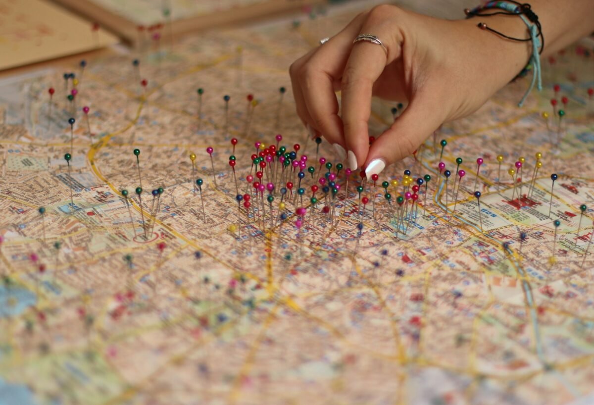
A surprising number of people walk into a building, glance at the map, and still get lost.
Not because they weren’t paying attention, but because the map was designed for the person who made it, not the person who needs it.

In high-traffic environments like hospitals, museums, and government centers, wayfinding issues slow everything down. They create frustration, wasted time, and in some cases, missed appointments.
There’s an entire field behind why people misread spatial layouts and how the right cues can make even complex buildings feel simple to navigate. It starts with understanding what overwhelms the brain and what builds trust during movement.
The Common Pitfalls of Public Maps
Most building directories make the same missteps. They overload, they assume prior knowledge, or they forget to anchor the visitor in their current physical space. Confusion tends to happen at intersections—literal and cognitive. When someone approaches a decision point without clarity, they stall. That hesitation can cause ripple effects for others around them.
The issue often isn’t the absence of information, but the way it’s presented. People don’t look at maps and memorize everything. They look for their next step. A multi-floor diagram won’t help if it doesn’t show what’s around the corner in the current hallway. Color-coded routes mean little if the colors aren’t repeated in physical space.
This is where design can either support cognition or make a mess of it. The worst offenders:
- Showing too many routes at once
- Skip critical “You Are Here” anchors
- Use labels or room numbers without matching those on actual signage
- Fail to visually differentiate public from restricted spaces
What Smart Wayfinding Systems Understand
The best signage doesn’t expect people to think hard. It reduces choices and gives visual confirmation at each step. Good systems rely on visual hierarchy, consistent iconography, and intuitive patterns that mirror natural navigation behaviors.
This is where smart design outperforms even high-tech solutions. Eye-level signs with arrows beat overhead banners if the overhead signs get lost in the clutter. Directional cues built into the flooring can outperform wall maps, especially in busy environments.
Well-executed systems often take their cues from cognitive psychology, which favors simplification over elaboration. Rather than mapping every possible outcome, they give users the minimum needed to make one confident decision at a time.
How to Spot When It’s Working
Good systems feel like they’re not there. The user flows, reassured by silent affirmations at every turn. These visual cues aren’t loud. They’re familiar, subtle, and frequent. When someone reaches their destination without having to ask a question or turn around, the system has done its job.
Smart wayfinding signage companies tend to design with these goals in mind. They avoid information overload and favor touchpoints that answer the most immediate need, not every possible one.
Here’s what well-built systems tend to get right:
- They anchor users in the present space with clear “You Are Here” indicators
- They provide directional confirmation through every hallway, not just at intersections
- They repeat color codes and symbols across digital maps, wall signs, and floor decals
- They remove outdated or irrelevant signage that adds visual noise
- They design with high-traffic human behavior in mind, not just building blueprints
Why People Rely on Repetition More Than Detail
Humans don’t scan entire maps when under pressure. They look for something they saw before. Repeated visuals, like arrows, symbols, or path highlights, build trust fast. When someone sees a recurring symbol or color, their brain gets a small hit of confirmation. That consistency turns a stranger’s path into something that feels familiar.
It’s the same principle behind branded design. Familiar fonts, shapes, and spacing help people feel grounded. In a building, that trust lets them move without overthinking every next step. A polished-looking sign doesn’t work if its color or shape shifts from one floor to another.
When Technology Doesn’t Help
Apps and interactive displays promise big things, but they often assume users will pause to interact. In reality, most people look for cues on the fly. A phone app only helps if the visitor already knows how to download it. A touchscreen directory loses impact if people don’t spot it quickly.
Digital solutions work best when they’re part of a larger visual ecosystem. If the signs reinforce what’s on the screen, users are more likely to trust both. When the physical and digital don’t match, neither works.
Make It Make Sense Faster
The best feedback a system can get is silence. If visitors aren’t asking for help, doubling back, or walking in circles, the signage is doing its job. A good system smooths the mental load of decision-making. Wayfinding that reduces friction is almost invisible. That invisibility, done right, is the outcome of careful planning

