



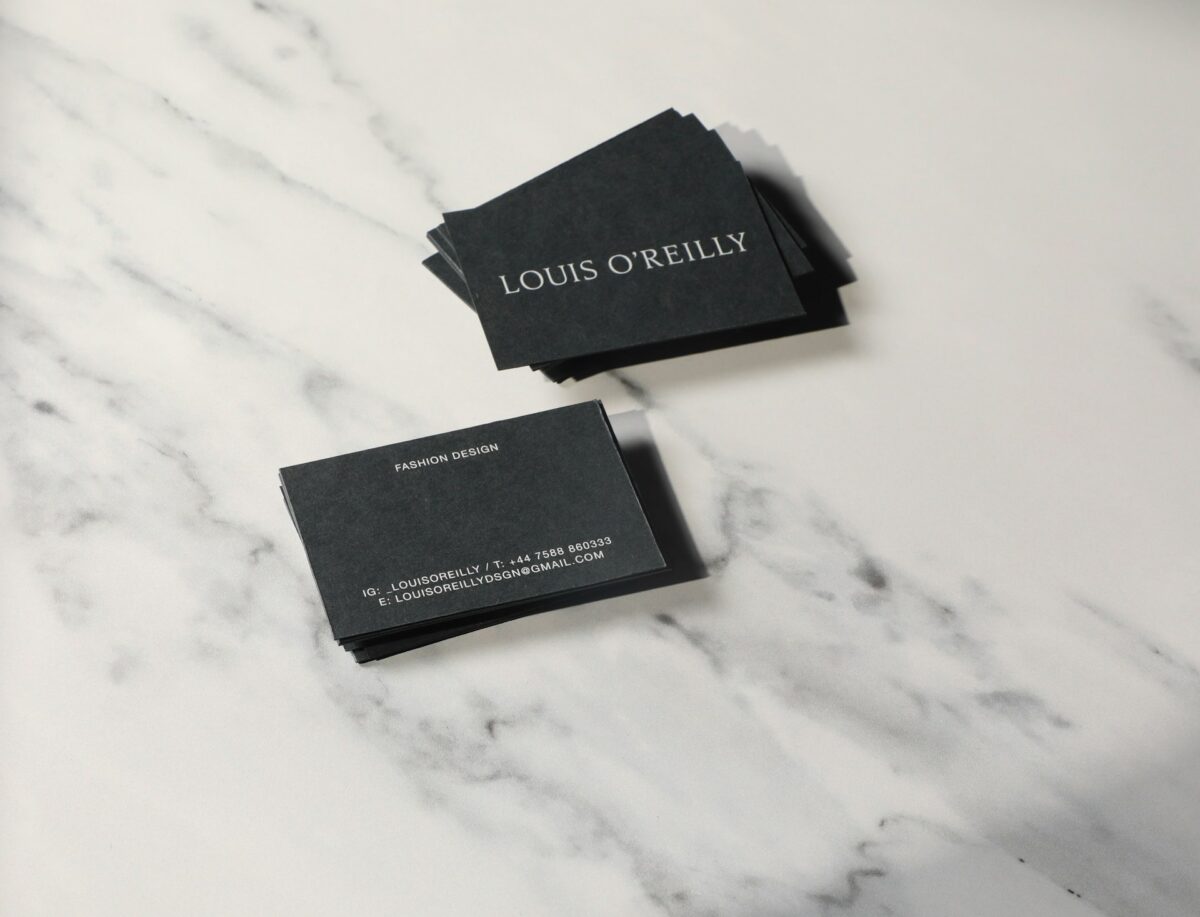

Twenty dollars gets you 500 cards that feel like cereal box cardboard. That’s the choice most founders make without noticing they made it. Your website gets a designer, your pitch deck gets three rounds of edits, and the one object a stranger holds in their hand for a full four seconds gets ordered at 11 p.m. from whatever site ranked first.
It’s the wrong place to cut. Print isn’t dead, it’s just unforgiving. A card either feels like something or it doesn’t, and the reaction happens before anyone reads a word. I’ve watched people slide a cheap card into a pocket mid-conversation without looking down. That’s the whole review, right there.
Fixing this doesn’t take a design agency or a big budget. It takes knowing three things: why paper weight decides how you’re perceived, which print format earns its cost, and how to brief a printer so you don’t pay for a reprint. If your brand kit extends past cards into catalogs, workbooks, or bound client guides, the same logic applies at a bigger scale, which is why a lot of studios now route that work through perfect bound book printing rather than stitching together separate vendors for cover, pages, and binding.
The four second handshake
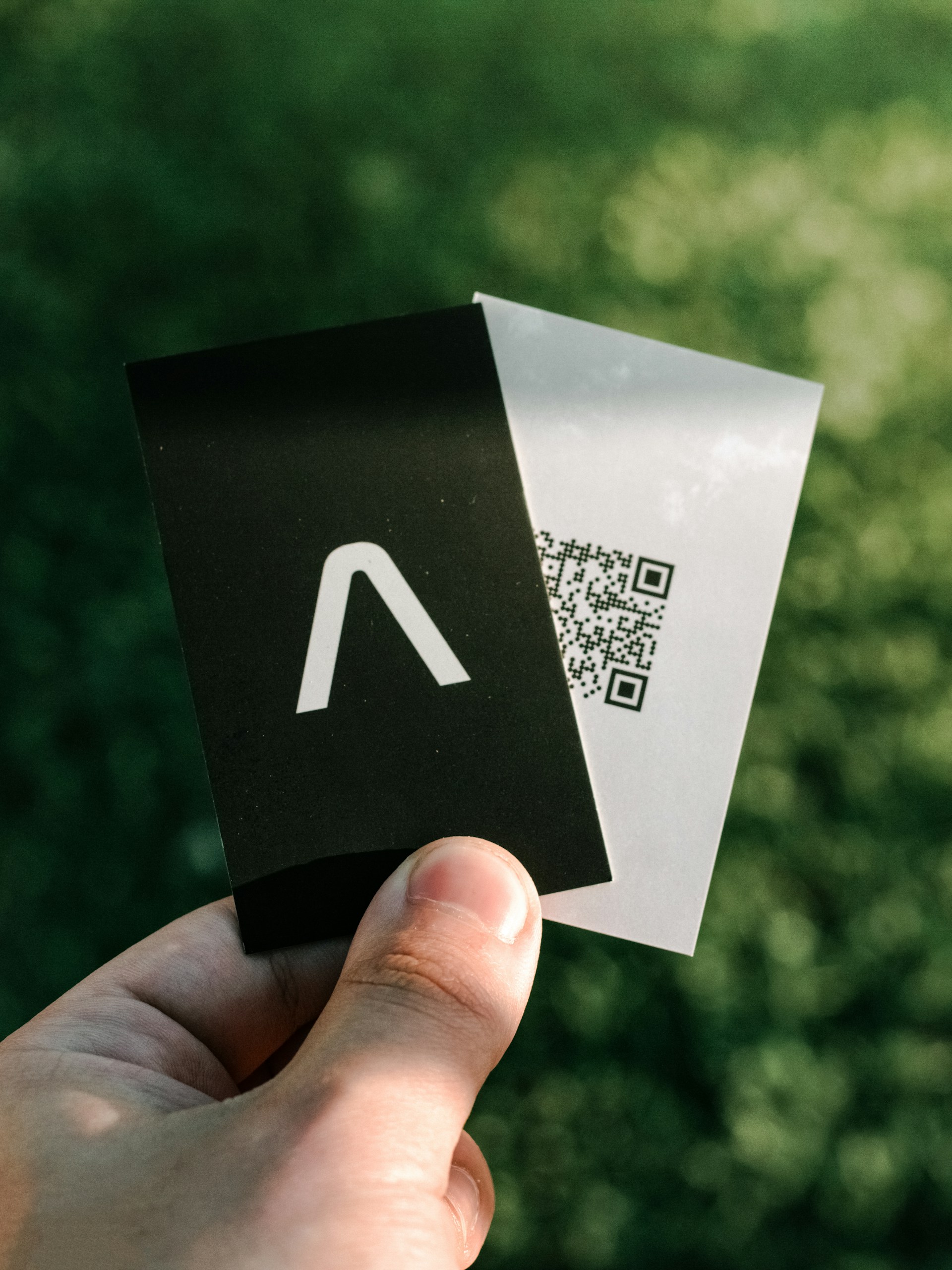
A business card sits in someone’s hand longer than your homepage sits on their screen. The physical feedback arrives first. Thin stock flexes and reads as temporary. Heavier stock holds its shape and reads as deliberate.
Here’s the counterintuitive part: paper weight matters more than your logo. A mediocre design on 16pt cardstock beats a beautiful design on 12pt every time. People can’t articulate why one card felt better, but they remember which one did. So stop treating the card as a logo delivery vehicle. It’s a texture sample. It’s a tiny proof that your operation pays attention to details nobody asked you to care about.
Pick a weight, then pick a finish, in that order
Printers quote by stock and finish, and the two get confused constantly. Weight is structural. Finish is tactile. Get the weight right first, because you can’t coat your way out of flimsy paper.
My stance: 16pt uncoated for anyone who meets clients in person, 14pt with a matte finish for anything mailed in a stack. Gloss screams 2009 to me. Soft touch is lovely until three cards in a wallet stick together like fresh paint.
Ask for a paper sample before you approve a run. Any decent shop will mail one free, and holding two stocks side by side settles the debate in about nine seconds. If you can’t hold it, you don’t know what you’re buying.
What small print runs actually cost you now
Short runs used to be the expensive option. You paid a penalty for ordering fewer than a few thousand pieces because setup dominated the price. That math has shifted as digital presses got faster, and it changed how small operators buy print.
Setup still exists, and it’s often covered under federal contracting rules where the government pays for work it needs, as the U.S. General Services Administration describes in its purchasing guidance. For the rest of us, the practical effect is simpler: you can order 250 pieces, test them in the real world, and reorder without eating a setup fee twice.
That’s a real advantage if you’re still figuring out your positioning. Order small, hand them out at three events, then reorder once the copy stops changing. Founders who print 5,000 cards in month one usually end up with 4,600 cards advertising a tagline they abandoned.
A quick decision grid
| If your situation is | Do this | Skip this
|
|---|---|---|
| You meet clients face to face | 16pt uncoated, no coating | Gloss lamination |
| You exhibit at conferences | 250 piece run, refresh quarterly | A 5,000 piece bulk order |
| You mail card packs | 14pt matte, uniform cut | Die cut shapes |
| You’re rebranding within a year | Digital short run now | Offset volume pricing |
| You send bound proposals | Perfect bound, small batch | Saddle stitch past 48 pages |
Saddle stitch or perfect bound, and yes, page count decides
This trips up almost everyone who graduates from cards to bound documents. Client guides, workbooks, and catalogs force the same fork in the road, and the wrong pick shows up as a spine that cracks or pages that drift.
Saddle stitch folds sheets in half and drives two staples through the fold. It’s quick and cheap, and it works up to about 48 pages. Past that, the book gets thick enough that it won’t sit flat and the outer pages creep outward. Perfect bound glues the pages into a squared spine, like a paperback novel. It handles longer page counts and looks more permanent on a conference table. That permanence is the entire point when you’re handing a bound guide to a prospective client who’s comparing you against two competitors.
Here’s the rule I use and would defend in an argument: under 48 pages, saddle stitch. Over 48, perfect bound. Right at 48, decide based on how the piece will be used, not the page count. Something read flat on a desk should be perfect bound even at 40 pages.
The pre-flight checklist that saves a reprint
Reprints happen because of file problems, not press problems. Run this list before you upload anything.
- Convert every image to CMYK, not RGB. Colors shift on press, and there’s no undo.
- Add bleed on all four sides. Element creep at the trim line is the most common visible defect.
- Keep text at least a quarter inch from the trim edge.
- Embed every font, or convert type to outlines.
- Check page count against your binding method, and make sure it’s a multiple of four for stitched work.
- Request a hard copy proof for anything over 250 pieces.
That last item matters more than the rest combined. Digital proofs render on a backlit screen, and backlit screens flatter everything. The Federal Trade Commission has long policed claims about recycled and environmental paper content, which is a useful reminder that the paper spec sheet is a marketing document as much as a technical one. Read it skeptically and ask what you’re actually getting.
Where to spend and where to save
Spend on paper stock. Save on coatings, foil, and die cuts until your revenue justifies the flex.
Spend on a hard proof for any run above 250. Save by ordering 250 first and reordering after your copy settles.
Print design has resisted full digitization for a reason. A press sheet, a trim, a binding decision: these are physical facts that don’t care how good your Figma file looks. The craftsmanship tradition behind that work is why a well made piece still reads as more serious than a PDF ever will. Your brand kit is only as strong as its cheapest component. Right now, odds are that’s the card in your pocket. Hand it to someone today and watch their face when they touch it. If nothing happens, you know exactly where next month’s budget goes.