Creating custom apparel requires preparing your artwork correctly right from the start. You need crisp high-resolution Vector files and simple bold lines combined with precise Pantone color codes to get vibrant and long-lasting results on the fabric. Getting a great shirt printed involves a lot more than just having a cool idea in your head or a rough sketch on a napkin.
There is nothing worse than opening a fresh box of expensive custom shirts only to find the logo is blurry or the colors are completely wrong. I have seen so many projects go off the rails because the technical prep work was ignored. We get excited about the creative side and completely forget the physical requirements of ink meeting cotton.
A solid design on a computer screen does not automatically translate to a wearable piece of clothing.
It takes a bit of planning to make sure the final product matches your vision. You want the garments to look professional and survive dozens of trips through the washing machine without fading into oblivion.
Start with crisp vector files
Printers absolutely need your artwork in a vector format like AI or EPS or a high-resolution PDF. Pixel-based images pulled from the internet are almost always low resolution which is way too small for physical production. They will result in blurry and pixelated prints that look incredibly cheap and unprofessional.
Vector files are built using mathematical formulas rather than static colored blocks. This means they scale infinitely without losing a single ounce of quality. You can blow up a vector logo to the size of a billboard and it stays perfectly sharp.
A complete disaster.
That is what happens when you try to force a low-quality JPEG onto a t-shirt. Industry data actually shows that a massive chunk of printing defects stem directly from poor resolution files. Submitting the right file type is the easiest way to avoid a headache later on. It seems obvious but people still try to print screenshots from their phones.
Keep the artwork simple and bold
Clean lines and minimal clutter translate much better to fabric than overly complex designs. Photographic images are notoriously difficult to reproduce accurately with traditional screens. You want high contrast and bold elements that the ink can easily fill.
I bought this band t-shirt at a gig a few years ago. The design was this incredibly detailed moody photograph of the band standing in a forest. It looked amazing on the merch wall but after two washes it turned into a giant grey smudge. I couldn’t even tell what it was supposed to be anymore. That happens when there is too much detail for the ink to hold onto.
Simplicity is your best friend here. Bold minimalist designs not only print sharper but they actually last longer through repeated washing. Trends are leaning heavily towards this kind of ‘simple’ aesthetic anyway so it works out well for everyone. Fewer details mean fewer chances for registration errors where the colors misalign during the printing process.
Nail down your color specs
Providing exact color specifications is a step you simply cannot skip. You need to use the Pantone Matching System to ensure your final printed colors perfectly match your brand guidelines. Relying on how a color looks on your laptop monitor is a HUGE mistake because every screen displays RGB colors differently.
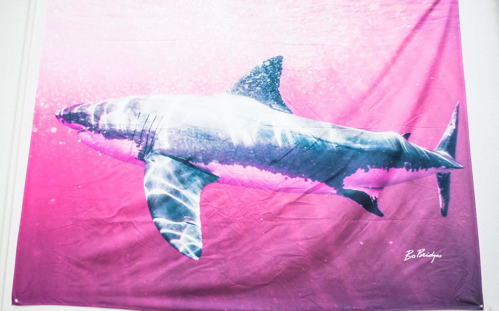
When you specify a PMS code you are giving the printer an exact recipe for mixing the ink. The deviations are incredibly small when you use this system compared to guessing with digital approximations. It bridges the gap between digital design software & the physical ink bucket. You also have to consider the color of the garment itself. The design needs to stand out and contrast nicely against the fabric. A dark navy logo on a black hoodie will definetely get lost in the shadows. Test prints are always recommended if you are unsure how the ink will interact with a specific fabric dye.
Sometimes you just have to trust the process and pick contrasting shades.
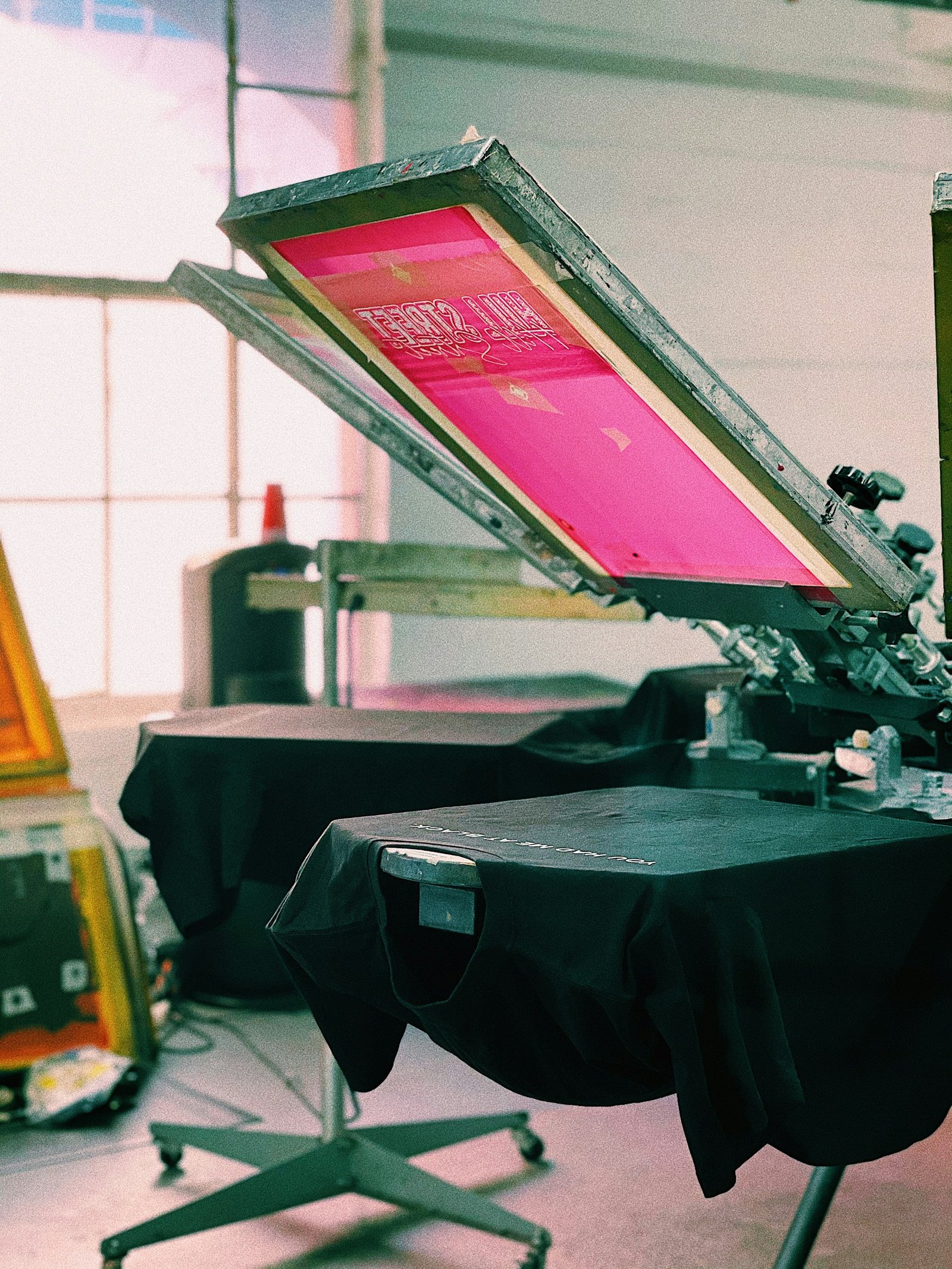
Watch your lines and text
Very thin lines or tiny fonts can easily get lost or fill in with ink during the printing process. The ink spreads slightly as it cures on the fabric at high temperatures. If your lines are under a certain thickness they will just bleed together and ruin the legibility completely.
Bold readable fonts are always safer. I think a good rule of thumb is to keep your fonts above 12 points and use a sturdy sans-serif typeface. It ensures the text remains readable even after the shirt has been worn and washed a bunch of times.
Modern automated software actually helps detect these incredibly thin lines and suggests thickening them up before the screens are even burned. But you shouldn’t rely entirely on software to fix design flaws. Build the artwork with sturdy elements from the start to accomodate the physical limitations of the ink.
Think about where the print goes
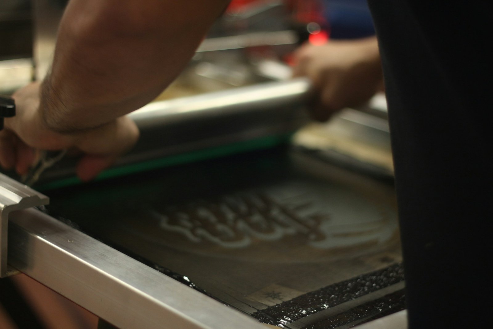
You really need to mind the print placement when setting up your files. Avoid placing critical design elements directly over seams or zippers. The ink application is disrupted by uneven surfaces.
The ink buildup around a thick seam can cause heavy cracking down the road. The squeegee needs a flat smooth surface to push the ink evenly through the mesh screen. Pockets and collars create physical barriers that mess up the pressure and leave weird gaps in your design.
Standard placements like the center chest or the upper back are popular for a reason. They offer a large flat canvas that is easy to work with. If you want something unconventional like a wrap-around side print you need to accept that there might be some imperfections where the fabric folds.
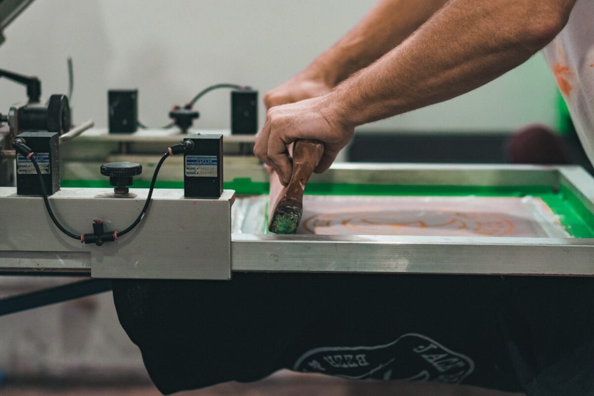
Manage colors and use an underbase
Limiting the number of colors in your design is a smart move for your budget. Every single color requires a completely separate screen to be burned and set up on the press. Keeping the color count down to two or three keeps costs very manageable especially for smaller runs.
It also reduces the risk of alignment issues. When you have six different colors trying to line up perfectly on a flexible piece of fabric things can get tricky. A restricted palette forces you to be more creative with negative space. If you are printing light colors on dark fabrics you absolutely have to account for a white underbase layer. This acts like a primer coat. Without an underbase a bright yellow ink printed on a black shirt will look muddy and green. The underbase makes the top colors vibrant and opaque.
Skipping the underbase is a rookie mistake.
Scale art for different garment sizes
A design sized perfectly for an extra-large hoodie might look completely overwhelming on a small t-shirt. You cannot just use one single file size for an entire mixed run of garments and expect it to look proportional on everything.
The artwork should be scaled appropriately for the specific garment mix you are printing. This might mean creating two or three different size variations of your file. It takes a little extra time during the prep phase but it makes a massive difference in the final presentation.
Nobody wants to wear a youth shirt where the logo wraps all the way into their armpits.
Talk to your printer early on
Getting feedback on feasibility before you finalize the files saves everyone a lot of frustration. Printers know their equipment better than anyone else.
Local expertise is incredibly valuable here. For instance when setting up a project for screen printing Albuquerque consulting with the local experts guarantees that your files are set up perfectly for their specific presses and the eco-friendly inks they might use. They can catch issues that you would NEVER even notice.
Many shops now use digital mockup tools to provide real-time feedback. You get to see a virtual version of your shirt before a single drop of ink is poured. This cuts down on revisions and ensures everyone is on the exact same page before production begins.
The Bottom Line
Following these preparation steps saves time and reduces errors across the board. It ensures your final custom apparel looks professional and exactly as you intended when you first dreamed up the concept. It is easy to get caught up in the excitement of picking out shirt colors & brainstorming catchy slogans. But the actual mechanics of vector files and Pantone matching are what make or break the project.
Take the time to prep your artwork right. Your printer will thank you and your shirts will look fantastic for years to come.