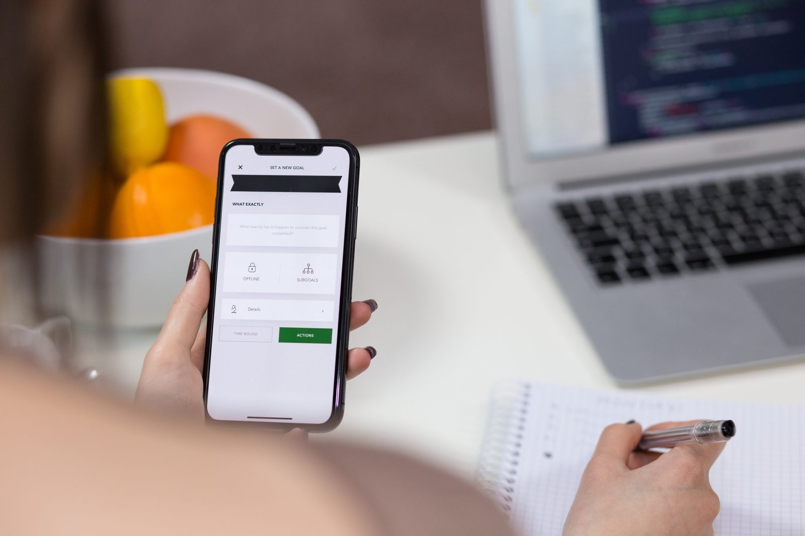
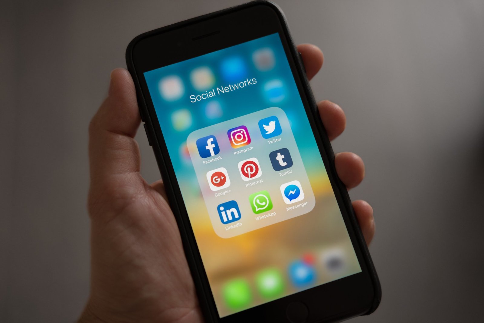
Designing for small, often subtle, psychological phenomena may seem pointless. But with more than 4 million apps available for smartphones, you have to take into consideration the psychology of it while designing the platform.
Codal, a UX design and development agency from Chicago, suggests six psychological hacks to make sure your mobile app cuts through the clutter.
1. Tell users what they want to hear
People, consciously or subconsciously, engage with messages that align with their beliefs. If you want your app to receive the downloads it deserves, listen to what they want.
About 14% of users won’t use an app that is difficult to use. To satisfy them, provide an intuitive navigation, designed in such a way that traffic flows from one page to another.
Instagram, which has roughly 700 million active users worldwide, came up with an intuitive navigation. Throughout browsing, the navigation options remain in the same place. The buttons are positioned in such a way that they can be used with just one hand, and users always know how to proceed when they want to access a particular screen.

2. Embrace the counterintuitive
Do the opposite of what users might expect from you. The unpredictability of it is what will capture their attention.
Reverse psychology is a great ‘pull’ tactic that curbs content flooding. When you stop screaming at users, you are allowing them to relax and put a lot more thought into your app.

3. Align with the customer’s self-concept
Before asking users to download your app, try to understand what their self-concept is. Then, find a way to fit your app within their self-perceived value. This will help consumers see themselves using your app.
Next time your UX design agency brainstorms concepts for your app’s UI, consider taking these three aspects into account: self-image (how users see themselves in society), ideal self (the type of user one wants to be), and self-esteem (how much users value themselves.)
This will allow your app’s design to align with a customer’s self-perceived value. Thereby, enabling a positive user experience, and potentially reducing customer churn rates.
4. The persuasive power of color
With 90% of subscription and purchase decisions based on color alone, the color is the second most important aspect of getting people to download your app, after functionality.
Colors don’t just help boost your download count, it also promotes interactions and helps recall value.
While a monochromatic palette involves taking each color from the same base, which is very easy on the eyes and can produce a soothing effect, a complementary scheme uses colors that are opposed to each other, which grabs attention.

5. Less is more
Many UX designers tend to provide too many choices to customers. When provided with too many alternatives, users end up confused, which makes them unhappy and exhausted, leading to abandonment. To avoid this, limit alternatives on your app, so users can arrive at clear decisions.
Human, an all-day activity tracker app, has a clutter-free interface with minimum menu options. With fewer choices to make, users find the interface extremely easy.

6. Wrap up
It’s not just the data that’s going to get you downloads—it’s about humanizing your app.
These psychological hacks give life to your application, resulting in a platform that’s inherently more likable and human-centric. Influencing user psyche can help you develop strong personal relationships with users, and encourage constant engagement, lasting long after the download.
![]()


